
Laibach Research
- Damian
- Feb 6, 2019
- 4 min read

About Laibach


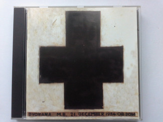
Laibach was created in June, 1980 Slovenia(Modern Yugoslavia). They were created in a small mining town near the capital Ljubljana. The name Laibach originates from the german name for the capital "Laibach". This is back when Germany occupied Slovenia during ww2. The group not only uses music to project their message but they also use various other mediums such as photos, posters, videos, installations, and etc. While researching the group, finding the members names was very difficult to find. They world as a collective and created stage names. The members are Eber, Saliger, Dachauer, and Keller. Based on the information I found it was clear the group started and created their entire basis on the idea of embodying the problems of the Slovenia government during the 1980s also known as the Socialist Republic of Slovenia. They mocked the idea by shining light on these delicate issues. Laibach main focus was about totalitarianism and fascism. In a sense their entire stage is satirical; they dress in military uniforms, and never break out of character. The stage they create is almost like a rally. During the 1980s the Slovenia government tried to censor them. They started to gain traction when they covered famous songs at the time, most notably The Beatles. They are also known for their signature cross. They wear it on their uniforms and was also banned during the 1980s.
The NSK

To take their ideals even further, Laibach joined with various collectives such as Irwin and theater group Scipion Nasice Sisters to form the organization Neue Slowenische Kunst, or New Slovenia Art. Together, with Laibach as the leading artists, the new group created various exhibits. What was interesting about this group was that they shared the same ideals about representing "touchy" subjects. Most of the poster work made by the group has a propaganda vibe to them. This goes perfect with the style Laibach represents. Once Socialist Slovenia fell, Laibach was highly praised in the country. One of the more unknown aspects of NSK is that they filed to be their own nation. They created passports that can be given out to anyone. With the NSK, they created their own following and "nation". This is such an interesting and just out there kind of way to stick to the overall message the group is trying to make. In a sense they have become the leaders of this nation they created.
Aesthetics

I would describe Laibach's style music wise is soft rock, and Avant- Garde, which refers to unusual ideas in the art world. They were very experimental and pushed the ideas of music. When they started to cover famous songs, the overall message of the song was changed. There was a more dark and serious tone when Laibach covered a song. However when looking at the art I can see two very strong styles. Within the many poster designs that were created I see much propaganda designs. The most notable time of these posters was ww2 posters when propaganda was at its peak. When you look at more specifically Russian style posters they share many similarities. There is usually a strong figure with big, bold sans serif. The most prominent color also is red. Red is usually associated with power and authority. This makes much sense going back to the idea of how they treat their concerts as rallies. Having these types of posters only makes their style more distinctive.
Another style that was brought up when researching was Dada art. During this art movement from 1916-1924 art was to raise questions about society rather that make art for art's sake. This is very apparent in Laibach's work. They are making their work to bring the ideas of fascism out and to have society talk about them. Even though some people take offense to this, Laibach believes that these ideas cannot go unheard and so embody them.
Project Ideas


After looking over the various styles for Laibach, I have come to the conclusion that the best approach to the art gallery is to showcase their work from the NSK. I do believe I can include their album cover works but the main idea I wish to tackle is this propaganda feeling they have created. My idea is to keep this idea going using red, the color of power, and the main color I have seen in propaganda posters as the primary color. It will be accompanied by white and by black. I am also thinking of using a beige color as well. The next idea I had is to figure out the text. The big thing with propaganda posters is that the majority of text is strong, bold, san serifs. My idea for this is to use Futura Extrabold for any headers, Verdana for any subheadings, and finally gill sans for any other smaller text. This gives me various different styles to work with but also keeping the san serif style only on my work. when it comes to the overall exhibit, I want to showcase their ideals and how they want to be portrayed to the world. I want people to look at these and have questions even if they are not sure. I think it would be really cool to have the exhibit in a propaganda style manner.


Comments