
Display Design
- Damian
- Apr 22, 2019
- 5 min read

Display Design
Can be classified into different types
- Point of Purchase
- Counter
- Window
- Wall
- Trade(Booth)
- Information
The idea of a display designer is to “use their design skills to help promote the image, products and services of businesses and other organizations” The main idea behind display design is to showcase a product or to display information for a certain brand. Much like other design tactics you want to be able to draw in your viewers and others who would pass by the display. With good use of color, type, and having a sense or hierarchy on the wall, the designer must work with a very different space. Unlike products which usually have labels, you are rather working with a space with much room and much information to showcase and work with. When starting with a display design the first step is to understand who you are working for and the brand in which you are making this display for. Though it is through your designing and vision you must be able to showcase the brand or company. Either by learning their vision and learning the message of the company, it will help you understand who you are working for. Display design can impact the viewer and even though someone is looking at a product or company, the design alone can influence the decision of the consumer to buy the product. Display design can be also called a science to me, because the displays are very particular in the way they display information and are meant to draw people into the display. It is organized and shown off to get people intrigued but also give people the right amount of information needed to understand the material they are looking at. Display design also seems to be much about planning and being in the trial and error stage. Since there is a lot of components not everything you think of will work with the overall design or with the rest of your ideas. You have to test out which will work and which will not. Making mockups and even making scale models will be most helpful in this building phase. You need to understand the materials you are working with and understand the layout of the display to make sure the two communicate and work well with each other.


21st Century Modern Design
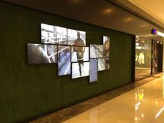
After doing much research on the idea behind a “21st” century design the main point I have found is that everything is full of simplicity. Much of the artwork and even the displays themselves that deal with this modern feeling have a clear sense of simplicity and elegance. They are very clean with their style and and execution of the displays. They will use black, white, grey, and then a simple accent color to match the exhibit or display. Many of the exhibits that follow this trend usually having a shape. This shape is then either repeated or used throughout the design. There is a clear sense of balance and everything is placed on the wall with meaning. They are either a part of an overall grid or kept in a way where all the elements of the display follow one another in a hierarchy. Another aspect I have noticed is the use of technology. Since it is about the 21st century many of the displays showcase things with many flat monitors on a wall. Sometimes they are also put into a shape and most of the displays seen use more than one. One material my group and I noticed a lot of was glass also. Since glass is very sleek and clean, it is the perfect material to have in a 21st century display. Finally type, which is another major factor, is usually big display fonts. Nice even san serifs are the main go to font for this design type, and can be used as headers, and even sub headers. Of course a good contrast to this would be a more classical serif. One element that I was surprised I did not see a lot of was hanging displays. I feel when these can be used as an advantage for a wall display and can interest viewers walking past to come and look.
Ideas for Wall Display
After looking at various examples of wall displays and gathered all of the information I have come up with a somewhat clear way of how I would want to execute the display design for the VCD program. The required pieces for this wall display are as follows;
- VCD logo
- Interchangeable student work
- VCD name
- Curriculum Guide/ 4 year plan
- Faculty info
- Facilities info
To integrate technology I think the use of a monitor would be perfect for the VCD wall design. With this you can display the VCD moving logo, the Faculty information, and even showcase some work. This can include works from motion design and creative coding. The main point that should come across when seeing this wall design about VCD is that we are a group of well rounded individuals that have had out hand and experiences all different ends of designing and the wall should showcase all work, not just flat work. I think there should be a display case, one rectangular shaped to fit package design works, and then one slanted to hold flat images. Another idea was to have the 4 year plan on hooks. This would make them easily accessible for anyone interested in the program. The works themselves I see following a grid layout on the wall, with glass over each to not only protect the work but make it easy to change them out. Another nice idea would to have plaques of glass with information and the name of the designer of each work. They can be etched into the glass and will keep that clean and stylistic look for 21st century modern. For the VCD logo I think it would be best to have a protruding logo on the corner of the wall that emits color. This can be an accent of blue, which correlates to the blue color of the room, or a strong red color to stand out. Also for lighting, the monitor should have the same accent or a white light surrounding behind it. For the works in the glass panels they could have light around the edges and for the casings there can be lighting coming from the bottom. Finally for type, I was considering a nice clean and very bold display font such as Avenir, contrasted by a more classical font such as Garamond.


Comments