
Project 3: Accordion Fold/Type Collection
- Damian
- May 12, 2019
- 2 min read

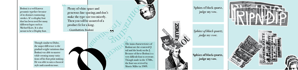
The final project was defiantly my most favorite out of the three. It brought together so many different elements that we acquired throughout the semester that made it a very interesting design to create. For this final project we were tasked with making a small booklet that showcased a font. We were given the opportunity earlier in the semester to chose from a list, from which I chose the font Bodoni. From there we had to research the font, and the person who created it. We also brought in our type collection that we created throughout the semester for this project. The idea was to also incorporate the type collection with our research about the font. At first I knew I wanted to so something playful. We were left with this project very open for any ideas, and I felt that my font with the collection I put together would be able to make some interesting graphics and type. My first thought was a collage, but after looking at my font I realized it had to have little more of an elegant feeling also. After finding out that my typeface designer created the font while print making, which helped define the font, I figure the best way to show my type collection is to have each piece like ripped pieces of paper, and to have the cover look like printing blocks by spelling out "Bodoni" from the collection. Next I wanted to be playful with the image of Giambattista Bodoni. I wanted to have him repeated but in different variations so it was not too repeating. I went to watch stop motions of cutouts that I've seen on youtube. This was the type I wanted to showcase, since it would work well with the items I had. Most of my collection has come from magazines and were very interesting in type and design. I played with my image of Giambattista by having him look as if he was "throwing up" the letters of his typeface. I created another one that the eyes were covered by one of the pieces of the collected, which a small collage of other pieces behind him. I then wanted to create another one that had his head cracked open, with more of the collection coming out of it. After creating these I new exactly how I wanted to piece the accordion together. The only issue I ran into was how to fill in more of the white space.I felt that in certain parts it was more relevant than others. TO soothe this I broke up my research so that it was more sparse. This gave the reading more of a flow which I thought worked. I also then added a quote by Bodoni which related to type and whitespace. Finally I added the key characteristics of the font which is the Q and the J. I made big letterheads and had each letter come out into the panels, cutting pieces of the letters off but still keeping the centered Q tail and the hook on the J. Overall I am very happy how the booklet came out and really enjoyed assembling it.


Comments