
Project 2: Bio Box
- Damian
- Apr 29, 2019
- 3 min read

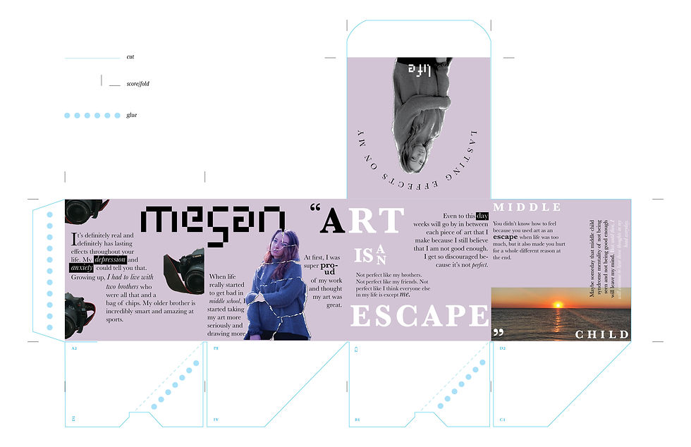
Receiving a second project during the middle of the first made me a little stressful at first, but I also gave me the opportunity to see what it feels like when I get out in the real world and have to work at multiple projects at once. It was getting me and my friends ready for when we have to get internships and honesty it was fun. The first step to this was to write a biography about ourselves. I wanted to make mine positive and wrote about how my life is like a "polaroid" and how I want to capture the moment. I wrote about a polaroid because I collect them and love retro things. I do think my bio was very reflective of me(Which is should be) and, since I did not know where we were taking the project, wanted to be honest. Next I had to gather a portrait of me, which I used one from the fall at one of my cousin's birthdays. Next was to get an image of an object. For this I chose one of my polaroids, which is pretty sentimental to me. Finally we had to chose a backdrop, which for this I chose a picture of New York City when I went during the summer. After collecting all of these we found out we had to switch this information with another classmate, and had to create a "Bio Box". This box would represent the person, and have most of the bio they wrote about themselves. I switched with my friend Megan, whom I know pretty well. After reading her bio I wrote down key phrases from it and words that stood out. I also wrote down the initial takeaway from reading it. I had the feeling of trying to find herself and how her anxiety and other outside forces has shaped her mentality. I wanted to showcase this and show how she is piecing herself together in life and in her design life. To start this idea off I took her self portrait and gave it a "tear" effect, as if it was torn apart. Then I pieced her back together. This would be the central and key image. I then asked her for her favorite color which was a light purple or lavender and used that as my one and only color. She also gave me a picture of her camera, and then a picture of a sunset she took on a beach. I started to create the box with the idea of making sure everything flows. You can easily create a nice layout on one side, but you cannot keep each side isolated. You have to see all of the sides to make sure everything has a system and flows withe one another. When seeing the box as one system I was able to picture and roughly put out my layout. I made sure to keep my text into different sizes giving me headers, sub headers, and text. Her name "Megan" was going to be one of the headers therefor to keep the hierarchy was the biggest. I also used her pixelated font to add a person touch. My quotes that I initially wrote down became the sub headers and I used the font Baskerville, which was the font she chose for our third project. After working on this box constantly I was able to achieving getting each side to work together. I struggled slightly with one side that had the image of the sunset. At first I had the image take up the entire panel, but soon realized this felt out of place. After cropping the image to just the sunset and adding text it started to feel more apart of the system. I was able to use many different elements such as black and white text, different styles of Baskerville such as italics, and giving the text interesting forms around the images to tell a story.


Comments